Wednesday 23 December 2015

Masthead Ideas (With Feedback)


As shown in the feedback above, the bottom (7th) masthead is preferred, as it is eye-catching and suits the genre (rock) of my magazine.

Tuesday 24 November 2015

October Feedback - Pupil Comment


KERRANG! Magazine Analysis

...

KERRANG! House Style

Monday 16 November 2015

Magazine Cover Feedback

I received the following feedback for my first magazine cover (shown below):


Sunday 15 November 2015

Magazine Cover Evaluation Questions

Question 1:
Question 2:
http://vocaroo.com/i/s0XRnm2UHXGR

Question 3:


Question 4:

I have learnt that I am more capable of producing a magazine cover when using Photoshop, as opposed to Fireworks. This is because I have spent more time on Photoshop, and it has a lot more features than Fireworks. This task did help me develop some of my skills in Photoshop, for example, I made use of the feature that allows you to group layers, as this made the .psd more organised. Also, I used the ruler tool along side the grid tool in order to ensure that everything with lined up right.

Thursday 12 November 2015

Survey Results Analysis

Q1: How old are you?
I asked this question to get a rough idea as to how old the average reader would be, as this will allow me to figure out whether I should use complex language or not. My results show that the majority of people are aged 17-18, however the margin between this age and the other ages is very small, so I will use language suitable for all ages.

Q2: Would you read a school magazine?
I asked this question to see if people were actually interested in reading a school magazine. My results show that the majority of people said that they would read a school magazine, however, this option only lead by one vote. This means that I will have to ensure that my magazine cover does a good job attracting potential readers, as it appears that people aren't too keen on reading a school magazine.

Q3: Out of the following three magazine titles, which do you prefer?
I was unsure on what title to use for my magazine, so I added this question to get an understanding as to what title people preferred. The results show a clear favourite, PB Gossip, which is what I will be naming my magazine. Plantsbrook News got no votes, which I think is due to the fact that it sounds too informal and serious.

Q4: Which of the following interest you?
I decided to ask this question so that I could learn which things people are actually interested in, as I did not want to add something to my magazine which nobody would read/enjoy. My results show clearly that every suggested element had somebody who showed an interest in it. This is good, because I can now appeal to a wider audience by containing all of these things.

Q5: How much would you be willing to pay for a school magazine?
I used this question to get an idea of the price that people would find reasonable for a school magazine. This will help me out, as I will be displaying the price of the magazine on the cover, so it is crucial that the price displayed is reasonable and will attract the attention of potential readers. My results show a range in opinion, as the same amount of people chose 10p - 20p, 20p - 40p, and 40p - 60p. However, 60p + received the least amount of votes, which shows that the price may be a little bit steep.

Q6: Would you prefer the magazine to revolve around student life, or school as a whole?
I decided to ask this question so I could understand what kind of content people would rather see in the magazine. The results show that more people wanted the magazine to contain information about school as a whole, as opposed to revolving around student life on its own.


Q7: Which of the following magazine layouts do you prefer?

I asked this question to figure out which one of my magazine layouts appealed the most to the potential readers. I felt that it was important to gain this feedback, as they are going to be the ones reading it, so it is important that I pick a layout that is widely liked. My results show that layout "A" (shown below) is the most popular, followed closely by layout "B" (shown below), with layout "C" (shown below) finishing with the least amount of votes.


Wednesday 11 November 2015

Music Magazine Genres

Music Magazine Genres
  • Pop
  • Rock
  • Hip-hop
  • Grime
  • Indie
  • Classical
  • Dubstep
  • House
  • R&B
Niche Audience

A niche audience is a small group of individuals who share a unique interest. 

The music genre that I am interested in is game music. I show a strong interest in this genre in particular as I am a huge fan of video games. Music can have a large impact on how successful and fun a game is, which is why the soundtrack is such an important element to consider when creating a game. As I tend to play games for a long period of time, the music is something that sticks with me for a long time. An example of this would be Crash Bandicoot on the PS1. Although I haven't played it for years, I can still remember the soundtrack.

Game music originated from the 1970's, when video games started to be come a popular form of entertainment. Old video game music was very simple, and it usually just consisted of a monophonic loop. In 1978, Taito relased the game Space Invaders, which was the first game to use a continuous background soundtrack. The soundtrack used was dynamic and interacted with the player, changing pace as the enemies got closer to the player. In 1980, Namco released Rally-X, which was the first game to contain a continuous melodic soundtrack.

Tuesday 10 November 2015

Magazine Survey Results Analysis

Q1: How old are you?
I asked this question to get a rough idea as to how old the average reader would be, as this will allow me to figure out whether I should use complex language or not. My results show that the majority of people are aged 18-18, however the margin between this age and the other ages is very small, so I will use language suitable for all ages.

Q2: Would you read a school magazine?
I asked this question to see if people were actually interested in reading a school magazine. My results show that the majority of people said that they would read a school magazine, however, this option only lead by one vote. This means that I will have to ensure that my magazine cover does a good job attracting potential readers, as it appears that people aren't too keen on reading a school magazine.

Q3: Out of the following three magazine titles, which do you prefer?
I was unsure on what title to use for my magazine, so I added this question to get an understanding as to what title people preferred. The results show a clear favourite, PB Gossip, which is what I will be naming my magazine. Plantsbrook News got no votes, which I think is due to the fact that it sounds too informal and serious.

Q4: Which of the following interest you?
I decided to ask this question so that I could learn which things people are actually interested in, as I did not want to add something to my magazine which nobody would read/enjoy. My results show clearly that every suggested element had somebody who showed an interest in it. This is good, because I can now appeal to a wider audience by containing all of these things.

Q5: How much would you be willing to pay for a school magazine?
I used this question to get an idea of the price that people would find reasonable for a school magazine. This will help me out, as I will be displaying the price of the magazine on the cover, so it is crucial that the price displayed is reasonable and will attract the attention of potential readers. My results show a range in opinion, as the same amount of people chose 10p - 20p, 20p - 40p, and 40p - 60p. However, 60p + received the least amount of votes, which shows that the price may be a little bit steep.

Q6: Would you prefer the magazine to revolve around student life, or school as a whole?
I decided to ask this question so I could understand what kind of content people would rather see in the magazine. The results show that more people wanted the magazine to contain information about school as a whole, as opposed to revolving around student life on its own.

Q7: Which of the following magazine layouts do you prefer?

I asked this question to figure out which one of my magazine layouts appealed the most to the potential readers. I felt that it was important to gain this feedback, as they are going to be the ones reading it, so it is important that I pick a layout that is widely liked. My results show that layout "A" (shown below) is the most popular, followed closely by layout "B" (shown below), with layout "C" (shown below) finishing with the least amount of votes.


Thursday 5 November 2015

Magazine Cover Evaluation

Magazine Cover Analysis

Masthead:
I chose "Plantsbrook Gossip' (stylised as PLANTSBROOK GOSSIP) as the title of my magazine, because it instantly tells the reader that the magazine revolves around Plantsbrook School. I used the colours red, white, and black, as these three colours are the main colours associated with Plantsbrook.

Logo:
Next to the title I placed the Plantsbrook School logo. I did this to reinforce the fact that the magazine is based on Plantsbrook School, as previously represented by the title. I made the logo roughly the same height as the title, so it looks visually appealing.

Main Image:
I chose a photograph of Plantsbrook as the main image, as it directly links to the focus of the magazine. The photograph features a few students in it, which is good because students are the audience that the magazine is aimed it. When I took the photo, I made sure that the right-hand side of the image contained the main feature (the "Welcome to Plantsbrook School" sign) as this portion of the cover was going to have no cover lines. Although the left hand side still contains a few features under the cover lines, I still felt that this image was very suitable, as the key focus is not blocked.

Images:
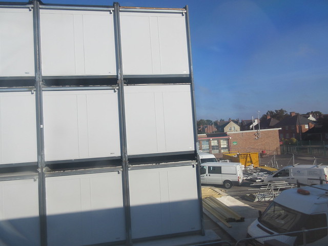
I used three other images on my magazine cover, all photos of the new build. I used these images as they link to a very large topic of conversation at school, and people are very interested in any developments being made when it comes to the new building. Using these images will remind the user that things are actually happening, and will leave them wanting to discover more inside the magazine. The three images are placed equidistant from one another, which makes them look very neat. The images all have a thin red border, which I chose based on the fact that it is a colour associated with Plantsbrook, and it creates a barrier that prevents them from blending in with the main image behind them. \

Cover Lines:

Thursday 24 September 2015

Website Analysis


MediaFire is an online storage service that allows users to upload and view files on a large variety of devices. After signing up for a free account, you are granted 10 GB of storage on the website, which is more than enough for most people. There are a few drawbacks to this website, however, such as the fact that it is partly funded by advertisements, which can be quite frustrating for some users. Overall, I think that MediaFire is an excellent website.
Prezi is a cloud-based website, which allows users to create brilliant presentations with ease. Unlike traditional presentations, all of the content is displayed on one canvas, as opposed to multiple slides. Users can move, rotate, and re-size anything at the click of a button, which allows for fast creation. After you have finished, the "Prezi" that you have created is saved to the Prezi servers, which can then be accessed from multiple devices.

Screencast-o-matic is a website that lets users record their screen, as well as their audio. The application has many useful features, such as allowing the user to only record a portion of the screen. After the video has been recorded, they are then saved as a video file, ready to be viewed.

Tuesday 22 September 2015

School Magazine Cover Observations


Titles:
The magazine titles are quite different. Two of them directly link to school (one is named after the school, and the other has the word "SCHOOL" in the title) however the other two don't show any link to education/school whatsoever.

People:
All of the magazines feature pupils, which makes sense considering the fact that they are all school magazines. Three of the magazines show students wearing uniform, however one of them shows a student in their own clothes, which suggests that she is in Sixth Form.

Headlines:
Three of the magazines contain distinct headlines on the front cover, however one of the magazines (Biddulph High Gossip) simply contains stories on the front cover.


Thursday 17 September 2015

Music Magazine Cover Conventions


Title: 
The names of the magazines are all located at the top of the page, and they are all printed in a large, sharp font in order to attract the attention of potential buyers. Another trend in the magazine titles would be the fact that the main celebrity on the front cover interferes with the text.

Celebrities:
All of the magazines feature a main celebrity on the front cover. In the examples shown above, the celebrity is placed int he middle of the cover, which leaves space on either side to fit in the headlines. The celebrities are all wearing unique and fashionable clothes, which reflect on the style of the magazine.

Background:
All of the celebrities are placed in front of backgrounds that suit the style of the magazine. For example, the magazine with Lil Wayne on the cover uses a black background, as Lil Wayne is shown in black and white. Another example would be the Cosmopolitan magazine with Taylor Swift on the cover, as the light blue background goes well with the blue dress that she is wearing.

Other Text:
There are a few similarities when it comes to the text used on each magazine, for example, all magazines feature key words that are presented in large, bold font. These are usually the stories that will appeal the most to readers, so they do this to make them stand out more. Another similarity with the text is that the magazines use more than one colour. This is done so that the magazine appears more vibrant and detailed.