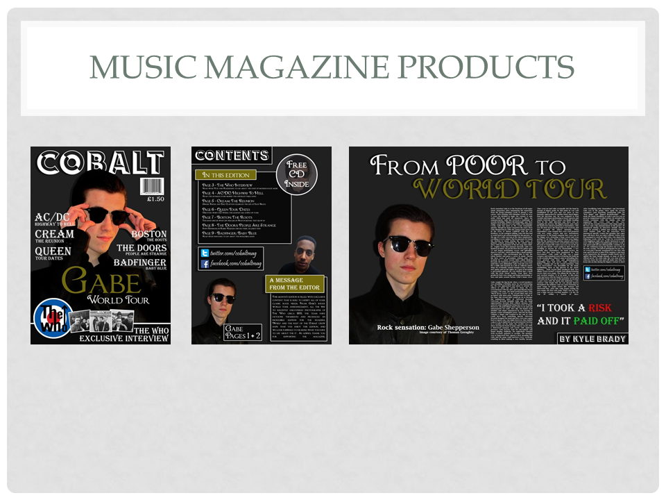
Front Cover

I imported an image of my subject, removed the background with the magic wand tool, and applied a slight amount of saturation adjust to make the image pop more. I then placed it on a grey background, and applied a slight shadow to give it move depth. I then applied the masthead slightly behind my subject, to make him stand out more. I then created multiple cover lines on either side of the subject, making the most out of the space that I had. I made the name of the artist larger than the name of the article, so that they stand out more. I then proceeded to create a rectangle with a thin white stroke, which I placed at the bottom of the cover. I then imported the logo for the band "The Who", as well as three images that I took of students pretending to be the band members. I placed these images over the rectangle, in which I placed more cover lines.

I then added the main anchorage text, and made the name of my artist gold so that it stood out in comparison to the other text on the magazine cover. I scaled this text so that it was larger than any other text that featured on the cover, as to further emphasise the importance of my subject. I then added a barcode and a price, as all magazines feature these things on the front cover.
Front Cover
To begin with, I simply imported an image that I had taken of my subject. I then removed the background using the magic wand tool, and placed him onto a grey background. I applied a slight drop shadow to the image to give it more depth, via the use of the "Blending Options" interface in Adobe Photoshop CS6." I then created a dark rectangle with a slight white stroke, again using the "Blending Options" interface. Inside this rectangle I placed the main text, which reads "CONTENTS." This rectangle was then placed in the top left corner, so it remains eye-catching whilst taking up a small amount of space, thus leaving more room for information.


I then created the main contents list, as well as a message from the editor. To start, I created four rectangles. Two of which were gold, the other two being dark grey. I then scaled these rectangles appropriately, and applied a thin white stroke to them. The stroke makes them more eye-catching, and will attract the readers attention. I placed the gold-coloured rectangles slightly to the side of the dark grey ones so it is more clear to the reader that the gold rectangle contains the heading.
I then proceeded to fill the grey rectangles with the appropriate information. Afterwards, I imported an image of the magazine editor. I then applied the magic wand tool in order to remove the background, and proceeded to place the image behind the rectangles.
I then began adding details to my contents page. Firstly, I created a social media box. I did this by creating another rectangle with a thin white stroke. Inside of this rectangle I placed URL's to social media websites, as well as a logo for the corresponding sites. I then created an advertisement for a free CD. I did this by creating another shape, a circle this time. I then cropped another image of my client so that it fit the circle perfectly. I applied a slight transparent effect to the image so that the text placed above it would be clearer and more easy to read. I then created one more rectangle, which I placed over the image of my main subject, Gabe. In this text box I included the page numbers that he will appear on in order to inform my readers.
Double Page Spread

I started off the double page spread by importing an image of my subject, removing the background with the magic wand tool, applying a shadow, and placing it on a grey background. I then added a title, in which I applied emphasis to the words "WORLD TOUR" by colouring them gold. I also added a small title on the image of my subject, as well as giving credit for the made up photographer. I then added the name of the fake journalist inside a dark grey rectangle with a thin white stroke.

I then proceeded to type my article, splitting it into several different-sized articles so that it fit onto the page better and didn't appear as one big block of text.
Finally, I added details to my double page spread. I added another copy of the social media box featured on my front cover, as well as a pull quote from the article above it.


 I asked two students who fit my target audience criteria the questions listed above and recorded their responses. I felt that the feedback given has benefited me a lot, as it gave me a great understanding as to how my target audience feels about my magazine, as has allowed me to understand how I can improve it. Their responses can be found below:
 I imported an image of my subject, removed the background with the magic wand tool, and applied a slight amount of saturation adjust to make the image pop more. I then placed it on a grey background, and applied a slight shadow to give it move depth. I then applied the masthead slightly behind my subject, to make him stand out more. I then created multiple cover lines on either side of the subject, making the most out of the space that I had. I made the name of the artist larger than the name of the article, so that they stand out more. I then proceeded to create a rectangle with a thin white stroke, which I placed at the bottom of the cover. I then imported the logo for the band "The Who", as well as three images that I took of students pretending to be the band members. I placed these images over the rectangle, in which I placed more cover lines.


 I then created the main contents list, as well as a message from the editor. To start, I created four rectangles. Two of which were gold, the other two being dark grey. I then scaled these rectangles appropriately, and applied a thin white stroke to them. The stroke makes them more eye-catching, and will attract the readers attention. I placed the gold-coloured rectangles slightly to the side of the dark grey ones so it is more clear to the reader that the gold rectangle contains the heading.


